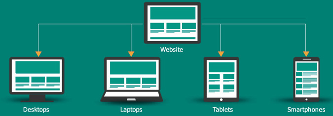
When it comes to mobile web design, the developers need to design the website for a mobile platform. This is so, because it is not just bringing the content smaller so the mobile screen, but also it is optimization the website content. For this you need a responsive web design for your website. But creating a responsive and custom website design is not easy for anyone. It need’s years of work experience. The designers should have years of experience in creating a responsive website design. Here are some of the essential points that designers need to take care while designing a website.
Designer Should Do
a) Understand The Need of Responsive Web Design
The responsive web design is created to provide an excellent user-experience for an ample range of devices. Usually, the user prefers to see the interactive websites, which have their size and layout compatible to the devices they are using. Through responsive website design, the users can easily read the text, visit various pages, open new links, and have complete control over the navigation. So, the designers should create a responsive web design for enhanced mobile user experience. The website should be mobile -friendly, optimized content, easy navigation and great visibility.
b) Should Have Adaptive Images
Website’s image plays an important role for the product based website. For eCommerce business, mobile shoppers are very essential as they bring huge business. So adding the product images to the website is just not enough. The designer should optimize all the images according to the responsive site. Once the images are optimised, they should be properly managed and adjusted on the responsive website. It should have techniques that can detect and adapt the user’s screen size automatically. For making the mobile adaptive images, it should have one line JavaScript, one PHP file, and one .htaccess file, which allow the users to drag and drop the files easily into the root directory.
Don’t Need
a) Abandon the Content
Usually, for fitting the content on a small screen, the designers hide the website content, which is not a good idea. Most of the users prefer to see the same content, what they have seen on the desktop website, in a different style. For hiding the content, the designers use the hamburger menu, which is located at the top of a screen. The hamburger menu is used for keeping the website clean and minimal, but it’s not a good option to use. As the customers did not like seraching for the hidden information, provide them the clear information and proper navigation to the searches they are looking for.
b) Ignore Designing for Touch
Currently, most of the users have touchscreen mobile devices, and prefer those sites which they can manage to touch. So, it is very important that the responsive website should have design that can manage to touch. The mobile site should have complete functionality with simple and easy accessibility.

